
 Version Française
Samples
Some simple samples
- My first map
- Import data
- Map process
- Intervals on map
- Clients on a road map
- Import Shapefiles
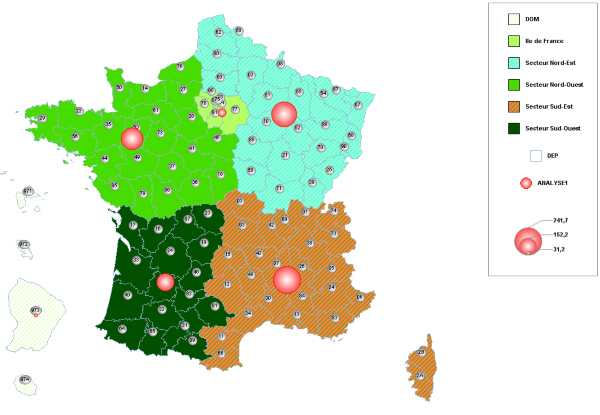
Process a more complex map
- Menu Fichier -> Ouvrir un fond de carte (.msh) and choose map SOURCES.FranceSecteur
- In data panel under the map, select SECTEUR column by clicking on a cell
- Right-click -> Variable SECTEUR -> Analyse sur variable discrète
- Menu Carte -> Schéma de couleur, choose color scheme FL, and apply
- Menu Fichier -> Ouvrir un fond de carte (.msh), choose map SOURCES.FranceDepIGN_GEOREF and select item ouvrez en superposition
- In the data panel combobox, choose POLYGONES to activate the FranceDepIGN_GEOREF layer
- Menu Carte -> Fond des zones, choose Vierge in list, and apply to the layer
- Menu Carte -> Bordures, choose ActiveCaption in list, and apply to the layer
- Right-click -> Variable CODE_DEPT -> Afficher les étiquettes
- In the data panel combobox, choose CARTE to activate FranceSecteur layer
- Right-click -> Variable ANALYSE1 -> Afficher / masquer les diagrammes
- You can customize colors of each object as you want after that
You can also run this code :
Proc COUCHEMSH ;
	Ouvre Fichier = 'SOURCES.FranceSecteurs' IsFondCarte  ;
	Select CARTE ;
	SetVarCategorie Var = 'SECTEURS' SchemaCouleurs = FL ;
	Legende Ancre =  HautDroite Orientation =  Verticale ;

	Ouvre Fichier = 'SOURCES.FranceDepIGN_GEOREF' nomcouche = 'DEP';
	Select Polygone = 'DEP' ;
	BackGround nom =  Vierge ;
	Border Nom =  ActiveCaption  ;
	SetEtiquettes Var = 'CODE_DEPT' nom = TraceInfo ;

	Select CARTE ;
	SetDisques HMax = 50 LMax = 50 Var = 'ANALYSE1' Nom =  BouleRouge ;
	Border nom =  Rouge2 ;

	CalqueCouche NomCalque = 'CADRE ET ARRIERE-PLAN' NotVisible ;
Finproc ;